Arrow Solutions: Brand
& Visual Style Guide
Welcome to the Arrow brand and visual style guide. This page serves as a comprehensive guide to help us consistently and authentically represent the Arrow brand across all touchpoints. Following this guide ensures that all communications have a warm, professional, and consistent tone of voice which represent Arrow Solutions’ trusted level of expertise, quality and service.
This guide provides a helpful framework to understand how the brand looks and feels. The brand identity has been thoughtfully created, and it is important that it is clearly understood and applied consistently by everyone across all communications. Below, the different elements that make up the brand will be explained – what they are, how they work together, and how to maintain consistency across all communications. It is recommended to read through this guide from start to finish, before any specific points are referenced.
Table of contents:
01 Brand Foundations
Our Key Pillars
Core Values
Brand Voice
02 Brand Logo
Design Rationale
Logo Anatomy
Secondary Logos
Spacing and Scale
Incorrect Usage
03 Brand Colours
Our Colour Palette
Secondary Colours
Range Colours
04 Typography
Our Primary Fonts
Supporting Fonts
05 Imagery & Iconography
Photographic Imagery
Icons
01 Brand Foundations
Our Key Pillars
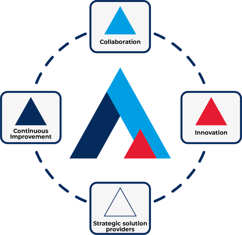
At the heart of the Arrow brand are four key pillars that define our identity and guide our approach to everything we do:
Collaboration – Collaboration is central to the way we operate. By fostering a culture of open communication and shared goals, we leverage the diverse expertise of our team to tackle complex challenges.
Innovation – Pioneering new paths is in our DNA. We’re not content to simply maintain the status quo – we’re driven to push the boundaries of what’s possible in industrial chemistry. Our innovative spirit fuels our continuous progress.
Strategic solution providers – Whether it’s a unique customer requirement or an industry-wide issue, we approach every situation with a focused, analytical mindset. Our team is skilled at identifying root causes and designing smart, practical solutions.
Continuous Improvement – We are continuously innovating and improving our products and processes to stay at the forefront of the industry. Our dedication to R&D allows us to deliver cutting-edge solutions that meet the evolving needs of our customers.
Core Values
Our four pillars are underpinned by a set of core values that guide our actions and decisions:
Excellence – We are committed to delivering the highest quality products and services, always striving to exceed expectations.
Integrity – Honesty, transparency and ethical conduct are fundamental to the way we do business.
Sustainability – We are mindful of our environmental impact and work to develop solutions that are responsible and forward-thinking.
Customer Focus – Understanding and meeting the needs of our customers is the driving force behind everything we do.
Brand Voice
When communicating on behalf of the Arrow brand, we aim to cultivate a voice that is:
Authoritative – Our language should convey the depth of our expertise and the reliability of our offering:
“As industry leaders in industrial chemistry, we draw upon decades of expertise to deliver reliable, high-performance solutions. Our rigorous testing and quality control ensure consistent results you can depend on.”
Approachable – We want to build genuine connections, so our tone should be warm, conversational and easy to understand. We speak in the first person to foster a personal connection.
“At Arrow, we understand the unique challenges you face. That’s why we take the time to listen and work closely with you to develop solutions that make your job easier.”
Innovative – The way we express ourselves should reflect the forward-thinking, pioneering nature of our brand.
“Innovation is in our DNA. We’re constantly pushing the boundaries of what’s possible, driven by an insatiable curiosity to find better ways of doing things.”
Open – We strive to be welcoming and accessible in our communication, fostering a positive and engaging experience for all.
”Feel free to reach out anytime. Our team of experts are here to provide friendly and knowledgeable support, ensuring you have the guidance you need.”
02 Brand Logo

Design Rationale
Our logo represents the pioneering spirit that drives our brand. The upward-pointing arrow symbolises our ambition to scale new heights and push boundaries in industrial chemistry. It embodies our unwavering commitment to innovation, problem-solving and product development.
At the heart of this logo are the four core pillars that define our business philosophy. These values underpin everything we do, guiding us as we are driven to ascend to new levels of excellence in industrial chemistry.
The dynamic, forward-facing design reflects our adventurous approach to the market. It positions us as leaders in the industry, constantly striving to redefine what’s possible through cutting-edge chemistry. Just as the arrow points upwards, our sights are set on continued growth, progress, and staying at the forefront of our field.
Logo Anatomy
The logo is a powerful visual representation of our core values and aspirations. It is a symbol of progress, innovation, and a pioneering spirit, all of which are essential to our success and our commitment to shaping the future of industrial chemistry.
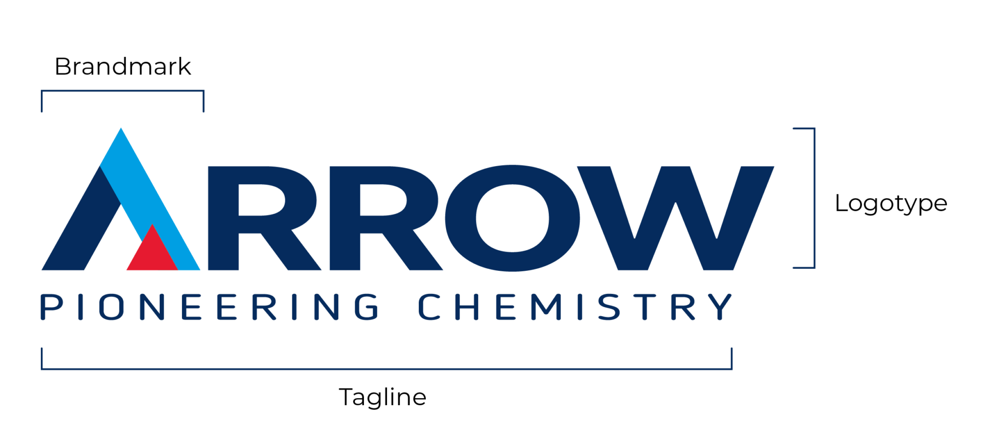
Brandmark
The iconic arrowhead is the heart of the logo, representing the four key pillars of the Arrow brand. Its upward trajectory symbolising our commitment to pushing boundaries and reaching new heights in the field of industrial chemistry.
Logotype
The type is set in a modern, sans-serif typeface, conveying a sense of clarity, precision, and contemporary relevance. The clean lines and open forms of the letters reflect our commitment to transparency and accessibility, while the bold weight conveys confidence and authority.
Tagline
“Pioneering Chemistry” is not just a tagline; it’s a declaration of intent. It encapsulates our unwavering dedication to innovation and our role as a leader in the industry. The tagline positions us as a forward-thinking company, constantly exploring new frontiers and setting the standard.
Colour
The blue and red colour palette reinforces the brand’s message. Blue evokes trust, stability, and expertise, while the vibrant red adds energy and dynamism, reflecting our passion for innovation and problem-solving.
Secondary Logos
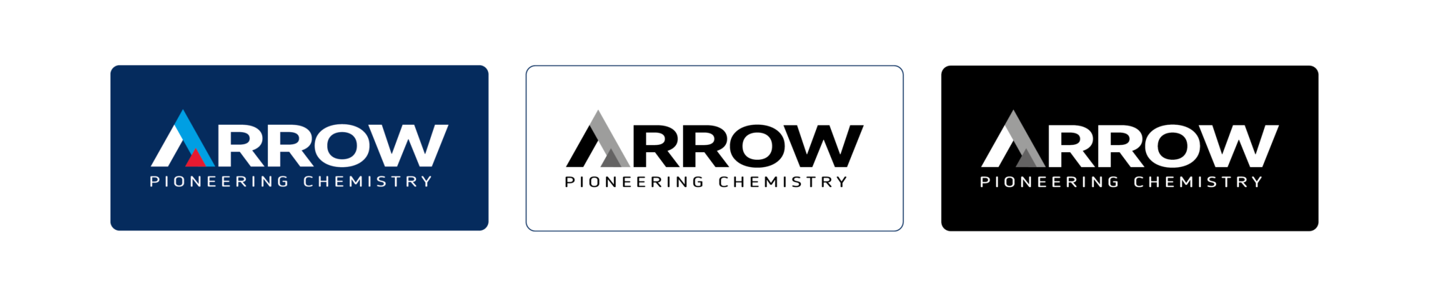
Our primary logo should be the default choice for all applications, and should only be substituted when a secondary logo is better suited to the specific parameters and needs of a project.
Spacing and Scale
Clear Space
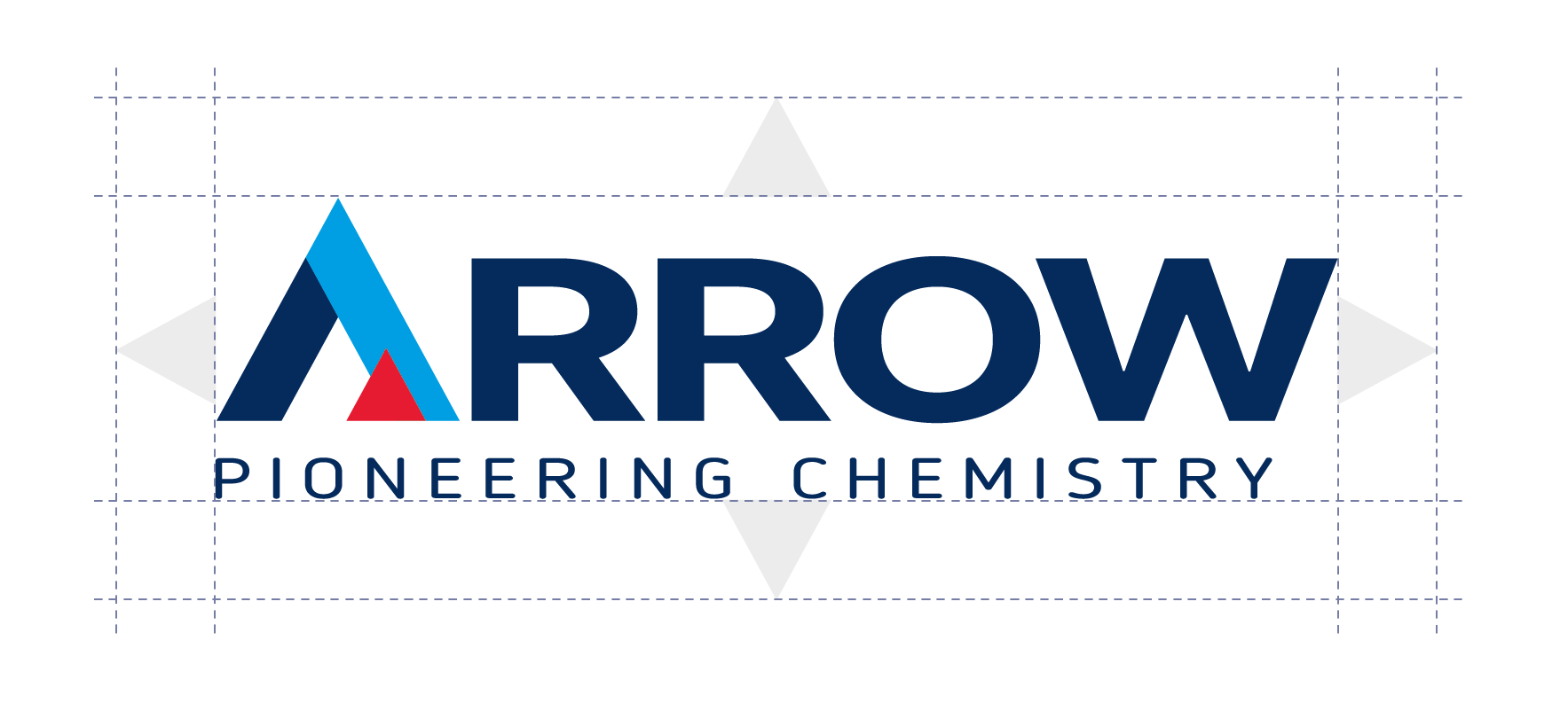
The minimum space around the logo is defined by the height of the white peak (the negative space within the brandmark). All supporting copy and graphic elements must maintain this distance in all applications.
Minimum Scale
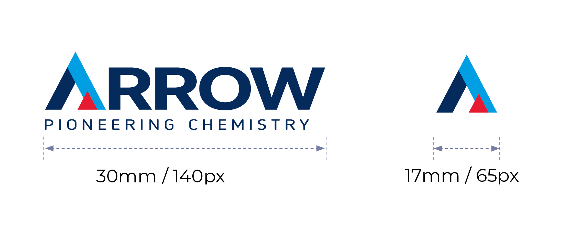
Establishing a minimum size ensures that the impact and legibility of the logo is never compromised in any application. The minimum width of the primary logo is 30mm for print applications and 140 pixels for digital applications. If an instance of the logo must be scaled below this, you may use the brandmark on its own down to 17mm or 65 pixels width respectively.
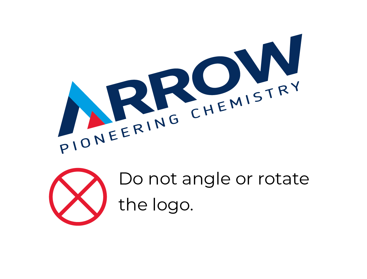
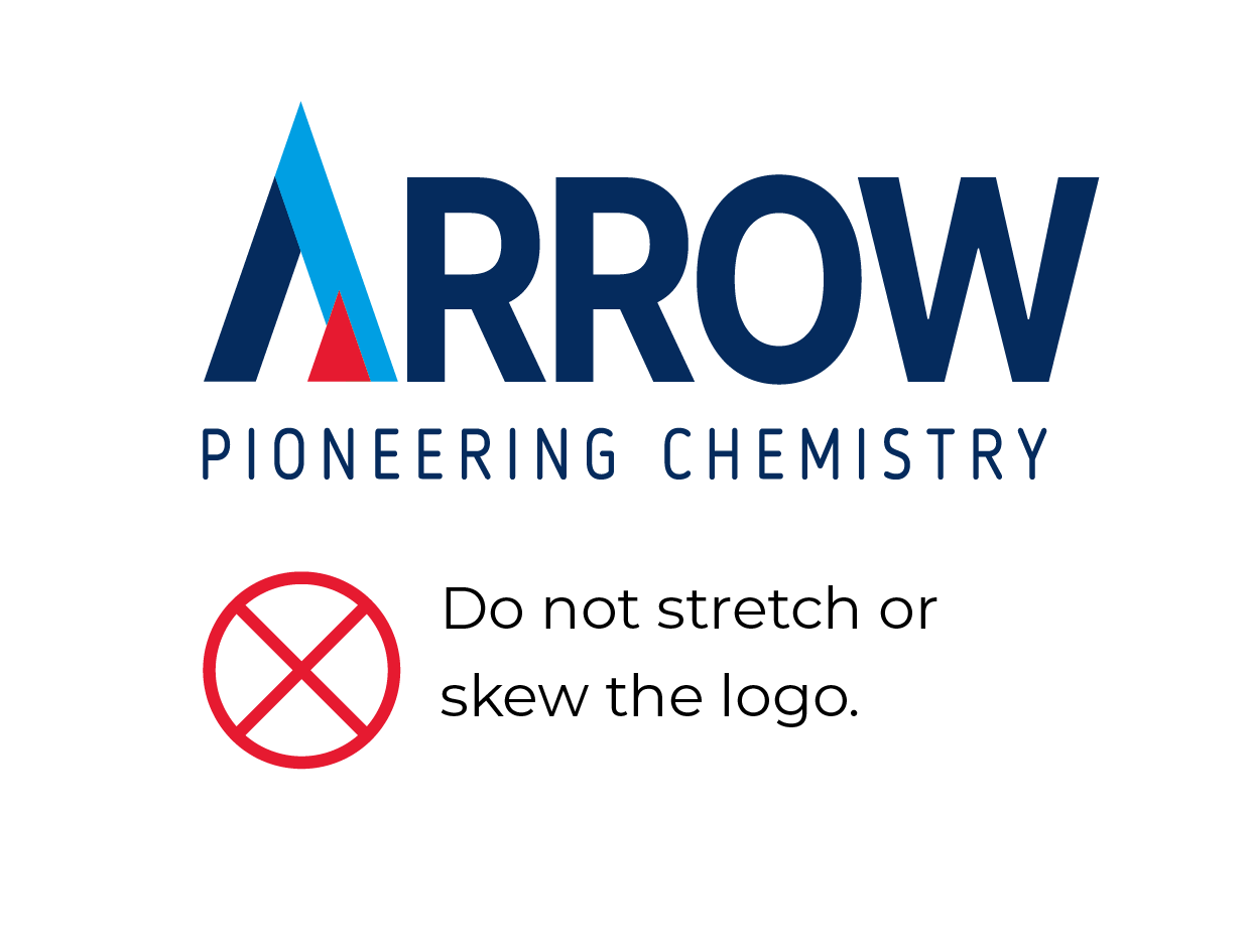
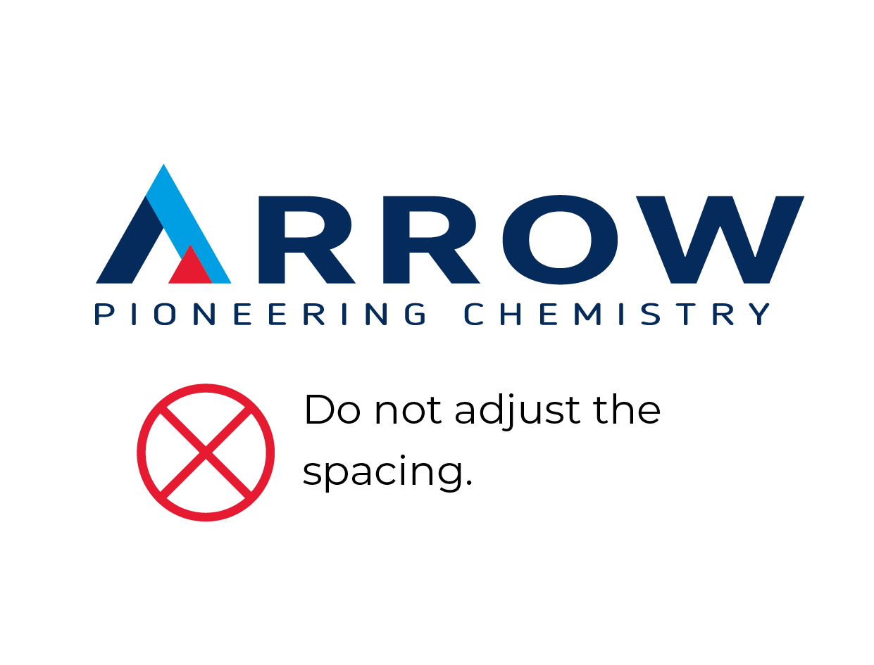
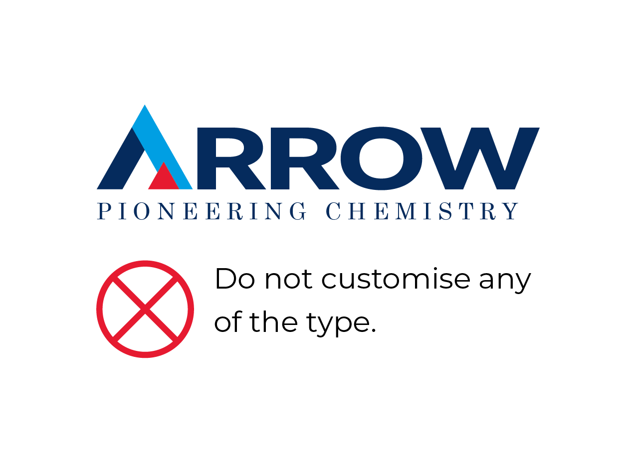
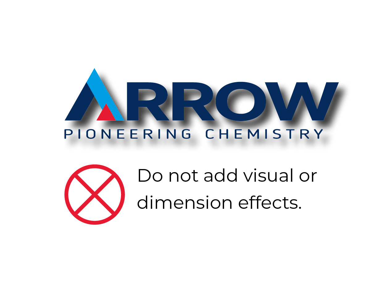
Incorrect Usage

03 Brand Colours
Our Colour Palette
The colours that make up our brand palette are carefully chosen to reflect the bold, pioneering spirit of our company. These hues serve as a visual representation of our core values and brand identity, helping to create a cohesive and impactful presence across all touchpoints.
Primary Colours
Arrow Dark Blue
Primary colour. May be used generously for headings, backgrounds and elements.
Print
C 100 M 75 Y 5 K 50
Digital
R 5 G 43 B 93
Hex #052B5D
Arrow Light Blue
Supporting colour. May be used for headings, highlighting and as an accent colour.
Print
C 100 M 0 Y 0 K 0
Digital
R 0 G 158 B 227
Hex #009EE3
Arrow Red
Supporting colour. May be used for highlighting and as an accent colour.
Print
C 0 M 95 Y 80 K 0
Digital
R 229 G 35 B 48
Hex #E52330
Secondary Colours
Arrow Mid Blue
Supporting colour. May be used for highlighting and as an accent colour.
Print
C 100 M 75 Y 5 K 25
Digital
R 4 G 59 B 123
Hex #043B7B
Arrow Light Grey
Supporting colour. May be used as a background colour.
Print
C 0 M 0 Y 0 K 5
Digital
R 242 G 242 B 242
Hex #F2F2F2
Black
Supporting colour. May be used for body text.
Print
C 0 M 0 Y 0 K 100
Digital
R 0 G 0 B 0
Hex #000000
Range Colours
Dishwasher
Range specific accent colour. For use on labelling, icons and range differentiation.
Print: C 100 M 50 Y 10 K 0
Digital: R 0 G 105 B 169
Hex #0069A9
Drain Care
Range specific accent colour. For use on labelling, icons and range differentiation.
Print: C 70 M 55 Y 40 K 20
Digital: R 86 G 97 B 114
Hex #566172
Floor
Range specific accent colour. For use on labelling, icons and range differentiation.
Print: C 0 M 75 Y 90 K 0
Digital: R 235 G 91 B 37
Hex #EB5B25
Housekeeping
Range specific accent colour. For use on labelling, icons and range differentiation.
Print: C 100 M 0 Y 60 K 10
Digital: R 0 G 142 B 121
Hex #008E79
Industrial
Range specific accent colour. For use on labelling, icons and range differentiation.
Print: C 100 M 0 Y 0 K 0
Digital: R 0 G 158 B 227
Hex #009EE3
Kitchen
Range specific accent colour. For use on labelling, icons and range differentiation.
Print: C 75 M 95 Y 0 K 0
Digital: R 101 G 45 B 135
Hex #652D87
Washroom
Range specific accent colour. For use on labelling, icons and range differentiation.
Print: C 0 M 100 Y 55 K 15
Digital: R 203 G 3 B 67
Hex #CB0343
04 Typography
Our Primary Font
Typeface selection is a strategic decision that can significantly impact how our brand is perceived. Montserat, with its modern, clean, and versatile character, aligns well with the professional, approachable, and innovative qualities we aim to embody. By consistently using this typeface across our communications, we establish a cohesive and recognisable visual identity that helps to build brand recognition and strengthen our connection with our audience.




Supporting Fonts
Myriad Pro serves as a versatile supporting typeface that complements the primary use of Montserat. With its elegant, yet highly legible character, Myriad Pro aligns well with our brand’s need for both professionalism and accessibility. By pairing Myriad Pro strategically with Montserat, we create a harmonious typographic system that reinforces our brand’s visual cohesion and enhances the readability of our communications.



05 Imagery & Iconography
Photographic Imagery
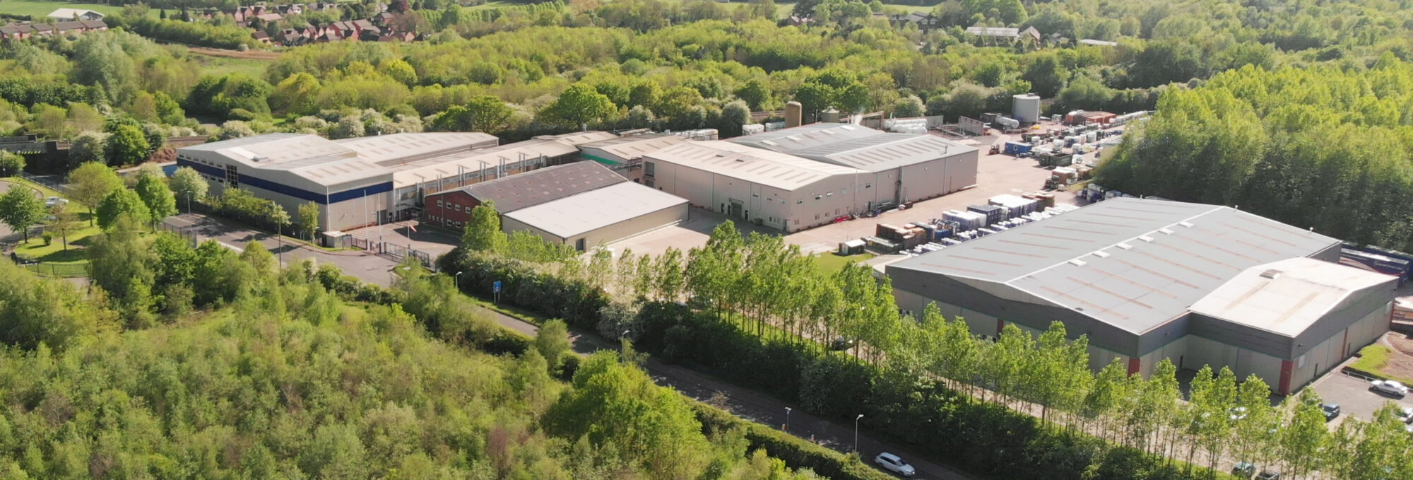
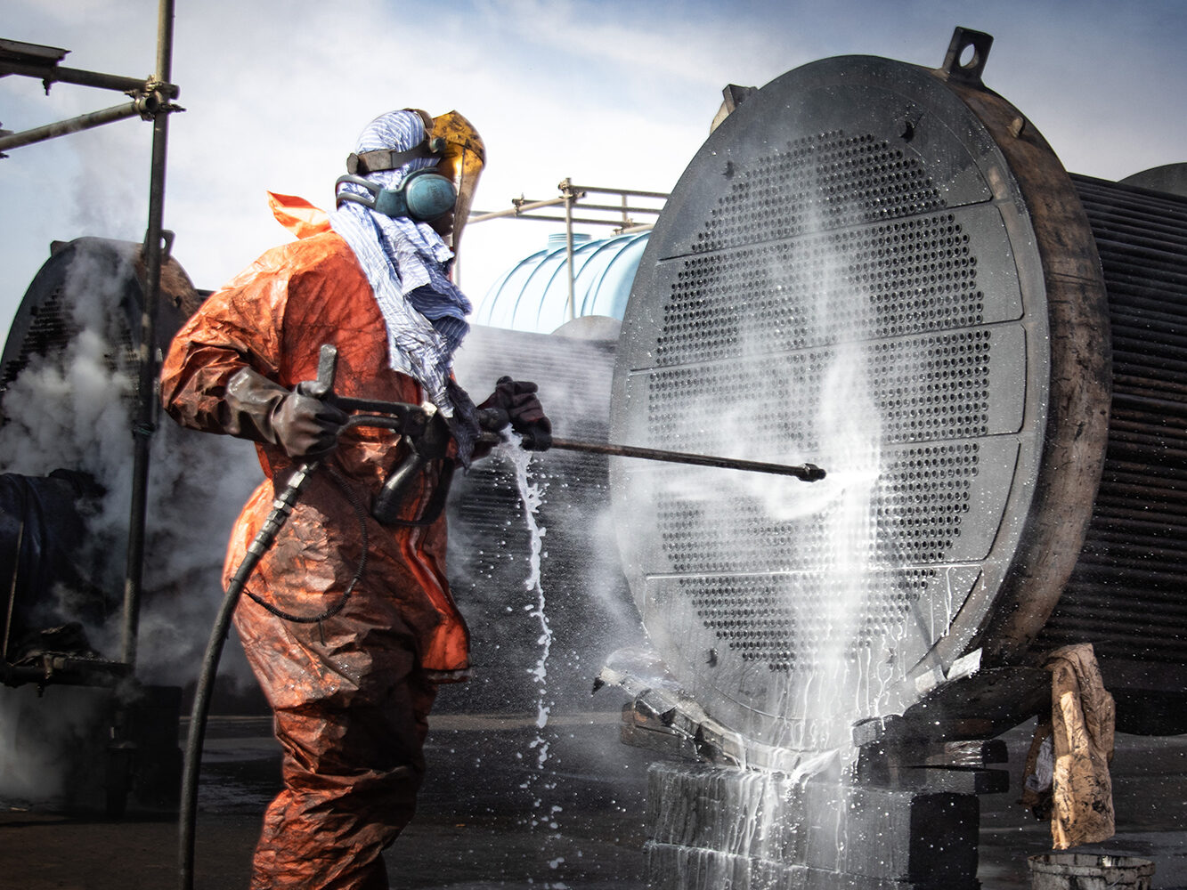
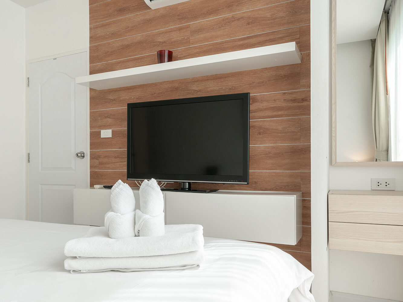
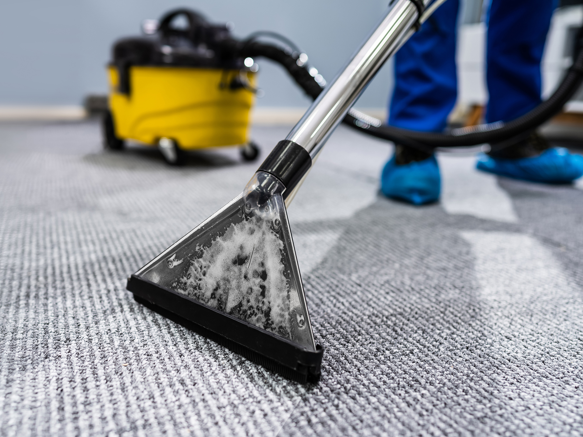
Visual storytelling is a critical component of our brand identity, and the images we use play a vital role in conveying our values and personality. Our marketing materials feature clean, crisp, and professional photography that showcases our products and services in a way that is both visually appealing and informative. This imagery style is designed to evoke feelings of trust, reliability, and effectiveness, while also highlighting the benefits of our products. By using high-quality, well-lit, and thoughtfully composed images, we create a cohesive visual language that resonates with our audience and sets us apart from competitors.






Icons
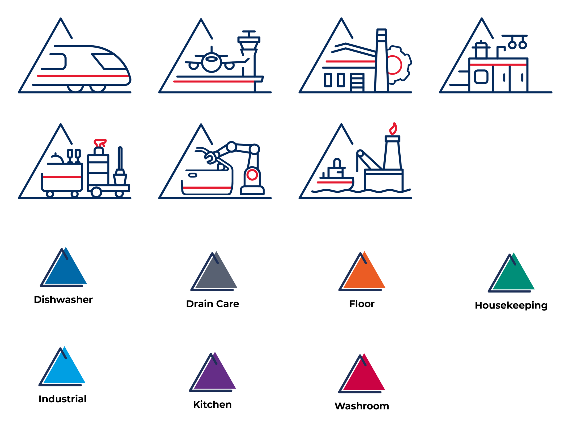
Our custom-designed icons are an essential element of our brand identity, providing a visual shorthand for communicating our values and personality. These clean, crisp, and professional icons have been carefully crafted to reflect the precision, quality, and attention to detail that define our products. By incorporating these icons across our marketing materials and digital interfaces, we create a consistent and recognisable visual language that reinforces our brand’s commitment to excellence and professionalism.